Part 4 in a series on improving Firefox’s Windows 10 start menu tile

Maybe we didn’t discover a fundamental law of the universe, but it’s a close second
As I mentioned in my last post, my attempts to add a high resolution image to Firefox’s Windows 10 start menu tile broke the tile images. My mentor and I spent some time debugging this, and found out a few things (including a solution). I’m copying my comment from the bug since it sums up our discoveries well:
1) To use Windows’s Resources.pri system, you need to have one Resources file
Not including a default language creates three resources.pri files (as mentioned previously), but not all of these resources.pri files apply for their scale. In other words, makepri.exe creates these three files by default:
- Resources.pri
- Resources.scale-140.pri
- Resources.scale-180.pri
but Windows only uses the file named Resources.pri and ignores the other two files/scales. We found this was the case by putting a number on all of our logo images in Microsoft Paint, changing the computer’s scale, triggering a tile refresh via Powershell, and then checking to see which numbered image is applied. At 100% scale, the 100% image applied, but this was also the case at the 200% scale unless we renamed our Resources.pri file (which covered scales 100% and 80%) to oldResources.pri and then renamed Resources.scale-180.pri to Resources.pri. Then the 180% scale image applied to the tile when the computer was 200% scale and at 100%. Apparently Windows will only use what is in Resources.pri and will ignore everything else.
2) Forcing makepri.exe to generate one file with a default language breaks the tile
When we set “en” to be the default language and created just one Resources.pri file, Windows didn’t seem to apply it. Instead it just seems to break the image’s relative path and no image displays on the start menu tile. The custom background color still applies though.
3) Solution: just use an image scaled for 180% resolution
We found that Windows will indeed scale down larger images for their start menu tiles . When we used a larger image, it did display better at 200% scale and also didn’t break/looked fine at 100% scale. My next patch will be to replace the smaller tile images with larger versions. Since we don’t need Resources.pri to do more than scale images (ie there is no other versions for other languages or contrasts), it doesn’t seem necessary to try to get Resources.pri working.
4) There is a small but noticeable quality difference for larger images on HiDPI screens
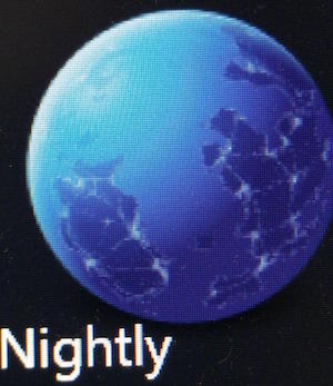
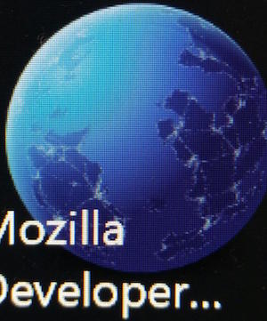
I’ll add some attachments showing the difference, but the lights at the edges of the countries are more defined for the HiDPI tile.
Lucky for you, dear readers, I don’t need to add an attachment. You can just see the difference here on this web page:
| Low resolution tile | High resolution tile |
|---|---|
|
|
|
Not a huge difference, but you know … it’s something.
One thing that’s sort of funny about HiDPI screens is that they push design ascetics towards simpler, flatter designs even though they have an even greater capacity for displaying them well. Mozilla’s Nightly logo has some complexity with the city lights, which makes it perhaps seem busy as a start menu tile image. But, at least I don’t have to redesign the logo :)
Well, that is one issue solved for Windows 10 start menu tiles. I’m still not sure why the custom tile appears only on some Windows 10 computers, but that is another mystery for another day.

